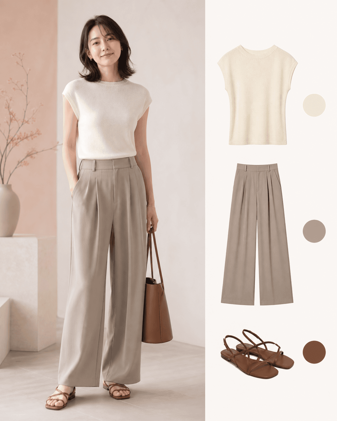
2026/27 Fall/Winter Color Guide
Seasonal color reports can create the feeling that something new must be bought. A forecast is more useful when it helps you see new combinations in the clothes you already own.
The Japan Fashion Color Association (JAFCA) calls its overall 2026/27 fall-winter womenswear theme “And And.” Instead of choosing one correct side, it considers combinations such as minimal and decorative, ordinary and playful, or technology and emotion. The colors are presented in four groups.
This guide starts with JAFCA's public descriptions and translates them into everyday wardrobe experiments. The photographs are editorial interpretations made to explain the ideas. They are not JAFCA's official color charts.
The short answer: the four groups differ more in combination than in individual colors
Gray or brown can appear in more than one direction. What changes is whether it is layered with another muted tone or interrupted by a vivid accent.
| JAFCA color group | How to read it in an everyday wardrobe |
|---|---|
| Sensory Receptors | Idea: very pale, luminous, evolving neutrals. Start with: ivory, light gray, and pale blue. Watch for: every piece having the same lightness and losing definition. |
| Lush Forest | Idea: dark, muted natural tones with a light-blue accent. Start with: deep green, brown, and charcoal. Watch for: dark colors making the whole outfit feel heavy. |
| Fun and Odd | Idea: lively color contrasted with brown. Start with: brown and either pink or clear blue. Watch for: too many accents competing at once. |
| Intellectual Games | Idea: pale or vivid play added to gray and brown basics. Start with: one unexpected accessory with familiar workwear. Watch for: accessories multiplying until there is no clear focus. |
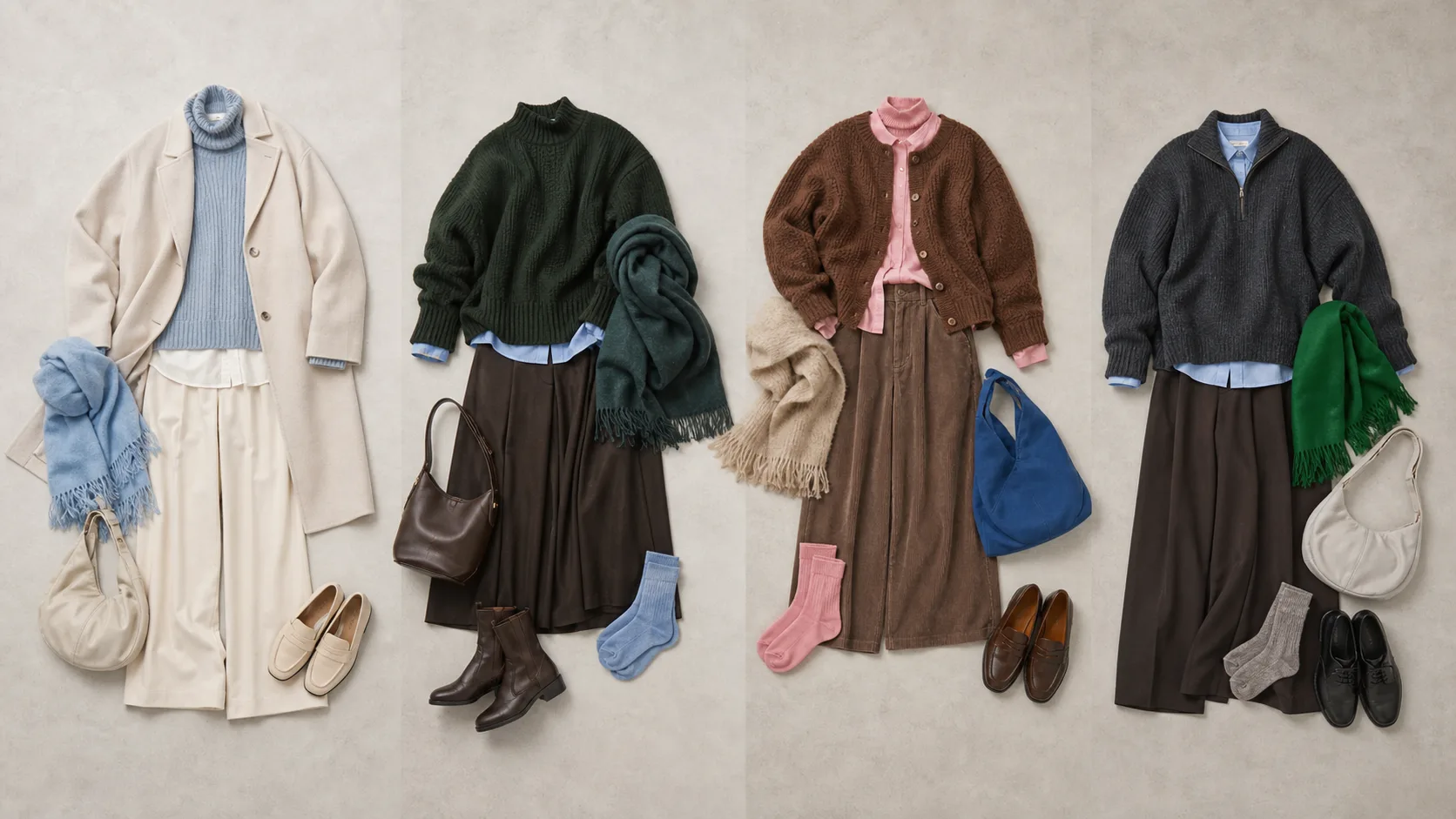
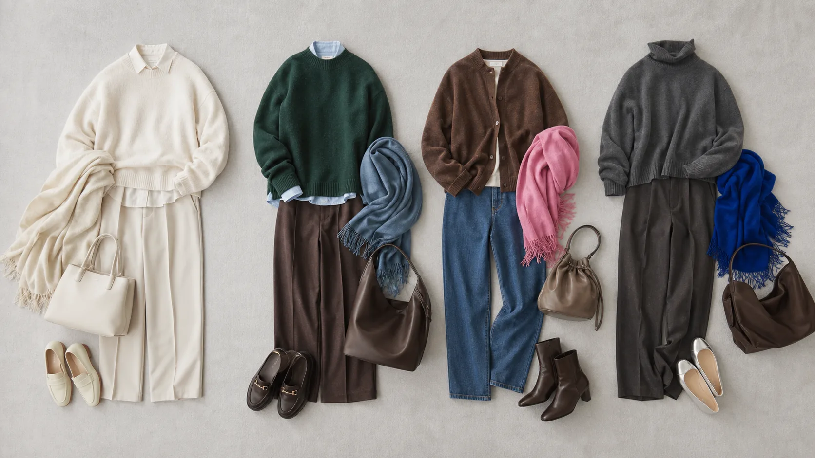
From left to right, the groups are Sensory Receptors, Lush Forest, Fun and Odd, and Intellectual Games. The overview uses more than one playful accent in the final two groups to show the range of each direction. The table above is a simpler starting point for readers who want to begin with one lively color.
About this image: These outfits are our editorial translation of JAFCA's public text. They are not official swatches, specified products, or endorsed outfits. Screen color also differs from the color of real fabric.
Three things to notice before choosing a palette
You do not need technical color theory. In front of a mirror, look at three practical variables:
- Lightness: how light or dark a piece appears, such as ivory compared with charcoal.
- Intensity: whether a color is grayish and quiet or clear and vivid.
- Area: whether the color appears only in a sock or covers an entire top.
Changing the area or placement of a color is often more useful than deciding once and for all that a color “suits” or “does not suit” you.
1. Sensory Receptors: build pale color with differences in lightness
JAFCA describes this group as extremely pale, delicate colors that reflect an ongoing interest in gray and the evolution of neutrals.
Start with what may already be in the wardrobe
- an ivory knit,
- a white or pale-blue shirt,
- light-gray trousers,
- a greige or soft-brown bag.
The outfit does not need to be white from head to toe. Make the trousers a little darker than the top, contrast the texture of a knit and a shirt, or let the shoes provide a brown edge. Small differences keep a pale outfit legible.
For a workday, try a pale-blue shirt, light-gray trousers, and an ivory layer. For the weekend, pair an ivory knit with softly faded denim and a light scarf. If pale trousers feel impractical, keep the lighter tones above the waist.
2. Lush Forest: place one line of light blue among deep natural tones
Lush Forest is built around dark, muted greens, blues, and browns. In JAFCA's description, a light blue acts as an accent associated with reflected water as well as a digital or technological note.
Deep green, dark brown, and charcoal can become alternatives to an all-black base. But using only dark colors can make the outfit visually dense. Show a small amount of pale blue at the collar, shirt cuff, sock, or scarf to break the dark area.
One forest-green knit, three real-life roles
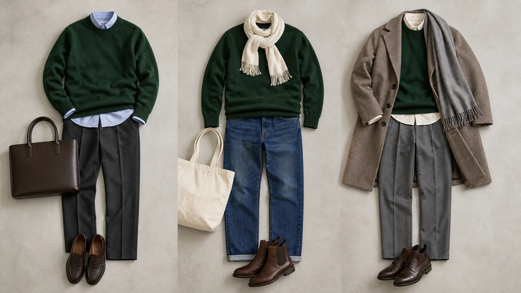
| Setting | Pair it with | What the color is doing |
|---|---|---|
| Workday | Pale-blue shirt, charcoal trousers, brown bag | Blue lightens the collar and cuffs |
| Weekend | Denim, ivory scarf, brown boots | Denim connects the forest tone to familiar casual wear |
| Temperature change | Gray trousers, taupe coat, pale base layer | The palette still works after the coat comes off |
Applying “And And” to repeat wear is our editorial interpretation, not an official styling rule. It is a useful test of whether a seasonal color can serve more than one part of your life.
3. Fun and Odd: interrupt brown with one lively color
Fun and Odd uses clear, energetic colors in contrast. Brown introduces nostalgia and a slightly unexpected quality. The goal is not perfect harmony. A small degree of tension is part of the idea.
If you are new to strong color, choose one:
- brown cardigan + pink shirt + denim,
- brown trousers + pale knit + clear-blue bag,
- dark-brown coat + gray outfit + vivid socks.
When using both pink and blue, do not give them the same visual weight. Let one occupy the shirt while the other appears only in a sock or small accessory.
The same pink changes role when its area changes
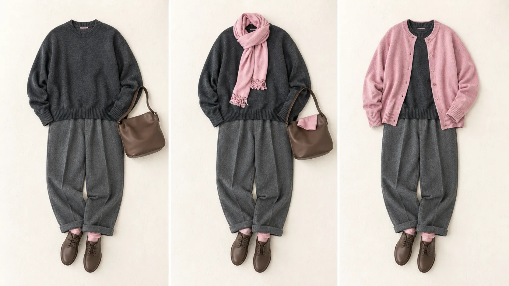
On the left, pink is a small accent. In the center, it is a noticeable supporting color. On the right, it becomes the focus. There is no universal correct percentage. Start small, step back from the mirror, and increase the area only when you want more emphasis.
JAFCA also selected Heartfelt Pink as its message color for 2026. The association explicitly distinguishes a message color from a simple prediction of what will trend or a color designated for a particular product category. We use pink as one practical example here, not as a fifth fall-winter group.
4. Intellectual Games: add one playful move to familiar basics
This group places pale or vivid fun on ordinary gray and brown. Unlike Sensory Receptors, the aim is not to keep the whole outfit delicate. It is to interrupt a familiar basic with one unexpected move.
Try a green scarf with a charcoal knit and gray trousers, or a pale-blue bag with a brown jacket and white shirt. For work, one playful element may be enough. On a day off, you might use two.
If the outfit becomes busy, use the “one main character” test in the Guide to Subtracting Accessories. Remove whichever accessory you added last—shoes, a bag, or a scarf—and look again.
Audit the wardrobe in ten minutes
Before shopping, place these items on a bed or clear floor:
- two bottoms you wear often,
- three knits or shirts,
- one outer layer,
- one pair of shoes and one bag,
- two small accessories such as a scarf or socks.
Keep the two bottoms fixed. Choose one of the four directions and change only a top or accessory. A seasonal palette does not require replacing the full wardrobe.
Three small outfit plans
| Purpose | A practical test |
|---|---|
| Workday | Keep: gray trousers and familiar shoes. Change: the shirt or scarf. Check: does it still work when the outer layer comes off? |
| Weekend | Keep: denim and your usual bag. Change: the knit or socks. Check: is the outfit still comfortable for walking? |
| Temperature change | Keep: a light top and bottom. Change: the removable layer. Check: can it handle both morning and midday? |
The guides to using scarves, choosing a bag, and changing an outfit with shoes can help you decide how much visual space an accessory should occupy.
How to fix a combination that is not working
| What feels wrong | First adjustment to try |
|---|---|
| Pale colors look undefined | Make the shoes, belt, or bag one step darker |
| Forest tones feel too heavy | Show a white collar or pale blue near the face |
| Pink or blue looks disconnected | Place brown or denim between the accent and black |
| There are too many accessories | Remove one of the shoes, bag, or scarf choices |
| The color works but the outfit feels wrong for the weather | Keep the color relationship and change only the fabric weight |
The last point matters during Japan's long periods of lingering heat. The Japan Meteorological Agency's two-week outlook gives a guide for the second week using five-day averages centered on days 8 to 12. It does not promise a precise outfit forecast for one distant day, but it can help you judge whether to delay a heavier knit when temperatures are expected to run above normal.
Try it for seven days and record use, not just photographs
You do not need seven different outfits. After wearing a combination, note three things:
- Did it feel comfortable for a full day?
- Could it handle the difference between indoors and outdoors?
- Could the colored piece connect with another item you own?
An outfit may photograph well and still feel distracting after several hours. Another may look quiet but become the combination you reach for repeatedly. A trend becomes personal only after that real use test.
Use the three-outfit test before buying
When a seasonal color catches your attention, write down three outfits it could make with your existing wardrobe:
- one for work or an appointment,
- one for a day off,
- one layered for a temperature change.
If only one comes to mind, test a similar color through a scarf or sock first. Japan's Ministry of the Environment also lists wearing current clothes longer and checking the wardrobe before deciding what is genuinely needed as actions consumers can take.
Frequently asked questions
Which of the four groups should I choose?
Start with the base colors already common in your wardrobe. Light gray and ivory connect naturally to Sensory Receptors; deep green and brown make Lush Forest easier to test. This is a wardrobe connection test, not a personal-color diagnosis.
What if I am unsure about vivid color near my face?
Move it to a sock, bag, or shoe. The same color reads differently near the face and at the feet. Change the area and location before deciding that the color does not work for you.
Can fall-winter colors work during a hot autumn?
Yes. Separate color from fabric weight. Begin with a deep-toned short sleeve, light shirt, or bag, then move the same color relationship into a knit or coat when temperatures fall.
Do I need to buy one “color of the year” item?
No. Make one combination with what you own and wear it for a day first. The useful part of a forecast is not owning more colors; it is gaining more ways to combine them.
Takeaway: choose one direction, not all four
- Give pale colors definition through lightness or texture.
- Break deep natural colors with a small white or pale-blue line.
- Use brown between a familiar basic and a lively accent, then adjust the accent area.
- Add one playful color to gray or brown basics.
- Before buying, make sure the color can work for a workday, a weekend, and a temperature change.
There is no need to test everything at once. Change just one color in tomorrow's outfit, then see how the combination feels over a full day.